SPRABS.COM | blog : TechnicalTravelPersonal | Profession | Photos | About | Contact

Wednesday, February 24, 2010

Tagsplanations: Explaining Recommendations Using Tags

Jesse Vig, Shilad Sen, John Riedl, University of Minnesota

Summary

Authors explore the design space of explaining recommendations to user.

Details

One of the research areas explored in improving transparency, trust and user satisfaction in recommender systems is explaining them based on item, user or a certain feature. Authors explore the relevance (relation between item and tag) and preference (relation between user’s sentiments and tag) of tags using explanations called tagsplanations.

image imageFor their experiment, authors tested four different interfaces based on different combinations of relevance and preference. Interface that showed relevance and preference while sorting using relevance scored highest in this study pointing that users preferred relevance but did not trust the system enough to view it alone. Both these attributes seemed to be of equal effectiveness.  Subjective tags seemed to perform better than factual tags but if depicting the same idea, users preferred factual tags. For future work, authors propose studying trust and scrutability of such a system.

Review

Authors have presented a strong design space exploration of recommendation explanations and make some insightful observations. In the words of author themselves, it would be desirable to have an empirical measurement of how well the explanations worked instead of using self-reporting.

Disclaimer

The work discussed above is an original work presented at IUI 2009 by the authors/affiliations indicated at the starting of this post. This post in itself was created as part of course requirement of CPSC 436.

Monday, February 22, 2010

Searching Large Indexes on Tiny Devices

Guy Shani et al., Microsoft Research

Summary

This paper proposes a novel technique for searching large indexes on devices with limited UI (5 keys and one line display). It employs a distribution based OBST (Optimal BST) extended to an OTST (Optimal Ternary Search Tree) using pinning. With shrinking mobile media devices, UI options become increasingly limited and a technique to allow user entry faster with lesser keystrokes is desirable.

image

Details

OBST relying on probability distribution of search strings would be faster than lexicographic BSTs. Authors extend this structure to an OTST by adding pinning. So while up and down keys traverse OTST in conventional sense to left and right subtree, and left key retraces route taken, right key traverses OTST to middle subtree which is a subtree with an extra character ‘pinned’ in the prefix string shared amongst all the child nodes. Authors argue that with prefixes often shared amongst artist and album names adding this new subtree enhances the search experience. Authors present quantitative comparison showing OTST to be the best technique amongst various other techniques. ROTST (Restricted OTST) represents a design choice based on user feedback where the middle subtree retains previous root as one of the options (even though users can simply end the search by pressing ‘enter’).

image User study shows lowest keystroke count and search times for ternary searches although spelling bases searches had lowest error rate because of being a well familiar concept. This tone was also reflected in user comments where though they preferred ternary searches, they recommended spelling based searches for an average user. Ternary searches register an improvement over binary searches in average time for single keystroke as users need to focus only on the working prefix string.

Review

Perhaps this paper represents the classic struggle between the ‘best thing to do’ and ‘simplest thing to do’. While OTST and ROTST ranked highest in the quantitative study, user preference for average user lied squarely with spelling based linear search. In the words of author, a key question that remains unanswered is what an average user thinks about this technique. Authors admit that their results might be skewed by their sample space which consisted entirely of Microsoft employees. Having said that, the technique is very innovative and consolidates existing search techniques in a neat manner.

Disclaimer

The work discussed above is an original work presented at IUI 2009 by the authors/affiliations indicated at the starting of this post. This post in itself was created as part of course requirement of CPSC 436.

Thursday, February 18, 2010

Evaluation of Expert Recommender Systems

Tim Reichling & Volker Wulf, University of Siegen

Summary

Expert recommender systems (ERS) hold a great potential and this paper does an evaluation of some such systems.

Details

Knowledge management (KM) has moved from repository based approaches to social networking based strategies. ERS is a major application for KM systems. Tradeoffs exist between automating profile builder and yet respecting privacy. Existing ERS use text matching algorithms, consider structured data can match different sources of personal data. Authors had developed an ERS called ExpertFinding (EF) for a European national industrial association for which they have performed this evaluation.

image EF uses two mechanisms for profile creation. First one creates a keyword list out of documents provided by users for this purpose. These documents are present on user’s local or a shared file system and could include dynamic data such as public email folders to get a tap on their day to day conversations. Another mechanism creates yellow page (YP) style form that is maintained by user themselves in case they wish to shape their expertise profile. A local, client end UI was made to allow people to search for experts by entering keywords.

Based on their evaluation, authors found that while ERS accurately found keywords indicating user’s domain of knowledge, it was inadequate in representing the nature as well as level of their expertise. Various incidents also cropped up of people bloating or expanding their expertise profile by means of YP. Authors present a 4 stage diagram where they envisaged their tool in balancing out workloads and representation of employees.

Review

From the paper it seems authors did a very poor job in building this tool and I describe why below:

  • user control over both profile generation mechanism meant that users could bloat their profiles which is exactly what happened.
  • choice of testers for tool evaluation was done poorly with all testers knowing each other. This led to a very specific usage pattern where A searched only for people A knew. Sample size of 23 testers also seems to be small for a study of such nature.
  • no socialising of profiles was available, an important extension could have been providing ability for people to comment on other’s profile. This could have added some authenticity to YP profiles.
  • the tool is too simplistic in nature. For ex. neither level nor nature of expertise was indicated on one’s profile.

Having said above, there were some good things in their study:

  • privacy concerns of users were well taken care of.
  • plugin based development allowed them to continuously re-deploy their tool easily.
  • to their credit, they described their work exactly as they did it without attempting to cover up.

Disclaimer

The work discussed above is an original work presented at CHI 2009 by the authors/affiliations indicated at the starting of this post. This post in itself was created as part of course requirement of CPSC 436.

Tuesday, February 16, 2010

The Inmates are Running the Asylum I

Alan Cooper

Discussion

In this book, author describes common problems that plague the world of software design. It says programmers belong to a separate species homo logicus instead of homo sapiens. Programmers make really good programs that are meant for other programmers. Their differences in perception with the rest of humanity however can cause problems when the software is not meant for them.

Author points out that programmers are running the show most of the time when it comes to designing how a user interacts with a program. The author shows that this has negative consequences on the finished product because either the programmers are taking shortcuts in UI design or misinterpreting what the users desire.

Disclaimer

The work discussed above is an original work by the authors/affiliations indicated at the starting of this post. This post in itself was created as part of course requirement of CPSC 436.

Saturday, February 13, 2010

SmartPlayer: User-Centric Video Fast-Forwarding

Kai-Yin Cheng, et. al., National Taiwan University

Summary

A new video interaction model allows video players to adaptively fast forward through mundane stretched of video while ensuring no areas of interest are missed.

image image

Details

Techniques of still image abstraction and video skimming try to summarise a video but face disadvantages in not being able to present to user finer details of areas they are interested in and ensuring nothing is missed out from the summary. Author’s SmartPlayer performs video skimming but instead of skipping, fast forwards ‘dull patches’. A user study was performed to find following user expectations about playback speed and base the SmartPlayer video flow on:

  • constant, when video is ‘interesting’.
  • changes gradually only.
  • changes based on minutes of viewed footage.

image Based on these, SmartPlayer has a motion and semantic layer to achieve video skimming. While motion layer adapts the playback rate, semantic layer detects predefined semantic events in the video. Personalization layer keeps track of user’s video browsing history. Based on user testing, it was found that SmartPlayer was quite useful in long, predictable videos with understandable characteristics and where audio was of secondary importance in nature.

Review

How many times does it happen with you that you have to fast forward through hours long wedding video to go through those ‘special moments’. Chances are a lot many times and this technique promises that those are going to be days in past. The technique proposed in this video sounds quite intuitive and it is only surprising that no one has thought of it before. It almost sounds like MPEG equivalent in terms of time spaced in viewing a video just like an MPEG would save on space used when a video frame does not change a lot over time.

Disclaimer

The work discussed above is an original work presented at CHI 2009 by the authors/affiliations indicated at the starting of this post. This post in itself was created as part of course requirement of CPSC 436.

Thursday, February 11, 2010

Performance Model of Selection Techniques for P300-Based Brain-Computer Interfaces (BCI)

Jean-Baptiste Sauvan, et. al., INRIA/IRISA

Summary

A model based on Markov theory has been proposed to predict performance of selection techniques of a P300 based BCI.

Details

Typical BCIs have been based on positive 300ms EEG signals. On being shown a display with one of the objects flashing, user starts to count which results in P300 being detected 300ms later. The interaction technique has been represented as static Markov chains. This allow authors to compute time required to perform an action and corresponding number of flashes needed. Three different techniques were proposed and validated against model:

  • Global : where any object can flash alternatively (& hence directly selected).
  • N-chotomic: where user selects one of N sub regions before selecting single target within that sub-region.
  • Relative: where user ‘move’ his selection from currently targeted object by moving to its neighbours.

imageimage 

Review

While I did not understand the mathematics behind Markov theory but it was interesting to read on BCI.

Disclaimer

The work discussed above is an original work presented at CHI 2009 by the authors/affiliations indicated at the starting of this post. This post in itself was created as part of course requirement of CPSC 436.

Autism Online

A. Taylor Newton, et. al., Univ. of Denver, Univ. of Oregon

Summary

This is an interesting comparison study on word usage of bloggers with and without Autism Spectrum Disorders (ASD) to show that ASD might be due to social contexts and vanish in ‘computer-mediated’ communications.

Details

A set of syndromes collectively referred to as ASD is marked by deficits in responding promptly to socio-emotional cues such as smiling back or maintaining eye contact. Authors have tried to find out how people with ASD fare in socially distal contexts in their communication skills. By taking Internet blogging as such an example, authors found 57 blogs from self-proclaimed ASDs and compared their word usage (using LIWC dictionaries) on a five-factor structure used previously in a study on blog linguistics of neuro-typical (NT) bloggers. Based on their results, they found that ASD word usage did not differ by more than 14% of a SD although there was 4 times as much variance in ‘Sociability’ factor.

Review

This study seems to validate what many in autistic community have claimed that Internet provides them a medium to ‘speak for themselves’. While loopholes can be pointed out in the sample size, uniform representation and increased variance in ‘Sociability’ words, to be fair to authors, they do mention performing an invasive research and comparing distal and proximal studies in future.

Disclaimer

The work discussed above is an original work presented at CHI 2009 by the authors/affiliations indicated at the starting of this post. This post in itself was created as part of course requirement of CPSC 436.

Saturday, February 6, 2010

Tilt Techniques

Mahfuz Rahman, et. al., University of Manitoba

Summary

Wrist-tilt has been explored as an input medium with focus on various influencing factors. Results show 16 ‘notches’ of control.

Details

Tilt has slowly become a popular control with usage in changing display mode of photographs, Wii consoles & cursor control. The paper explores design space for  wrist tilt and presents some design guidelines. A TiltControl sensor device was connected to PDA’s serial device to measure tilt angle. Following were the observations and design recommendations made on the basis of that:

  • Flexion/extension and pronation/supination can control 12 and 16 levels respectively (5 degrees along axes).
  • Performance times ranged from 1.5 to 2 seconds.
  • A 3D accelerometer can be used to pick up tilt along three axes.
  • Ulnar/radial deviation should be used minimally.
  • Discretization has an important role to play in tilt input with quadratic performing best in this study.

image

Review

The work has been well written and performs design space exploration for wrist-tilt inputs which could be useful for applications planning to use this mode of interaction in future.

Disclaimer

The work discussed above is an original work presented at CHI 2009 by the authors/affiliations indicated at the starting of this post. This post in itself was created as part of course requirement of CPSC 436.

Digital Games for Rural Indian Children

Matthew Kam, et. al., Carnegie Mellon University

Summary

This is a study to see how well digital games adapt across cultures and the playability issues within. It also performs an analysis of some traditional games.

image

Details

Videogames can be a great tool for education but a given game may not be as intuitive or exciting for somebody outside the influence of Western culture. Authors designed six different games based on existing successful Western games and tested them in three different Indian communities. Children were allowed to play the game on mobiles for 1.5 hours after giving them a demonstration. Following observations were made:

  • Children from urban schools had some prior exposure could understand certain tasks that were not represented in culture but were required for advancing in game.
  • Test scores seemed to not matter a lot in public schools.

image

Authors then went on to compare their games with some traditional games on various patterns and found some key differences. About 25% of concepts were completely missing while a fair proportion of concepts seemed fairly universal. Based on these insights, a new game was designed and following observations were made:

  • Children learned the game rules with very little explanation in contrast to previous games.
  • Players were visibly excited and seemed to concentrate more on winning the game.
  • Players showed engagement in contrast to frustration with previous games.
  • Some of the players found the game too easy.

image

Review

This paper is quite different from other such papers and that is why I decided to blog on it. While the study seemed lopsided with six games in first phase and only one game in second phase, authors do make detailed comments on various parameters where traditional games differ from video games. It also provides an insight into design of such games for different cultural settings.

Disclaimer

The work discussed above is an original work presented at CHI 2009 by the authors/affiliations indicated at the starting of this post. This post in itself was created as part of course requirement of CPSC 436.

Thursday, February 4, 2010

Single Large vs Multiple Displays

Xiaojun Bi, Ravin Balakrishnan, University of Toronto

Summary

This is a comparison study between large display vs single/dual monitor use. It provides an insight to design of interaction techniques on a large display system.

Details

Display sizes and numbers have been steadily growing over the last decade. Yet current displays cover 10% of human visual field. As part of this study, participant’s usage pattern  on a 6144x2034 display was observed for daily desktop computing and contrasted with traditional single or dual monitor usage. An activity and event log was maintained and followed with a daily interview.

image

On the basis of results, it was found that :

  • Large display was preferred most and even with dual monitors people ran short of screen space.
  • Mostly participants divided screen into ‘focal area’ for their primary tasks and used ‘peripheral area’ forimage other tasks. With dual monitors, focal area was restricted to one of the monitors (71%) as there was a visual discontinuity in between. In case of large display, the focal area was right in the centre (81%).
  • Certain activities such as web browsing had a worse experience in large display since applications did not scale well.
  • In case of large display, users put more time on layout of applications as it “helped them afterwards”.

image

  • When interacting with an application in peripheral area, it was dragged onto focal area even in the case of large displays.
  • While moving and resizing events increased in large displays, maximizing and minimizing decreased.

Review

This is a very insightful study and presents some very deep design insights that can be included in any application for large display. Clearly, user interaction patterns vary a lot with display size for ex. resizing increases as maximize decreases but app windows are generally meant to be easily maximized than resized based on ‘regular’ display size.

A big limitation in the study is that it does not study usage with more than two monitors which may become commonplace in future.

Disclaimer

The work discussed above is an original work presented at CHI 2009 by the authors/affiliations indicated at the starting of this post. This post in itself was created as part of course requirement of CPSC 436.

Sketch and Run: A Stroke-based Interface for Home Robots

Daisuke Sakamoto et. al., The University of Tokyo

Summary

A sketch/stroke based interface for controlling robots.

Details

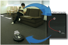
Of late, humanoid robots have grew in terms of range of things that they can achieve, walk, climb, play and what not. While high cost and limited features remain a big deterrent for such robots, an intuitive way to control these robots also remains a problem. Authors have tried to build a high level sketch based interface for controlling a popular vacuuming robot iRobot Roomba

image

An array of ceiling cameras were used to provide a more meaningful and accurate live top view of a room. ARToolkit was used to detect objects and some standard stroke gestures were mapped to robot movements for example a cross means stop. In pilot test, users entered these stroke gestures on a computer screen showing the live view from cameras. It was observed that subjects were able to use the robots without any prior knowledge of robots. Moreover the interface allows asynchronism between command and execution.

image image

Review

The application is very nifty and can have certain obvious advantages over speech based interface for controlling robots. However it would not completely replace it as certain actions are more easily spoken than sketched and speech can utilise pre-existing language constructs while sketch requires users to remember/create their sketch commands. I believe authors would face these limitations of a sketch interface as soon as they move beyond vacuuming robots.

Disclaimer

The work discussed above is an original work presented at CHI 2009 by the authors/affiliations indicated at the starting of this post. This post in itself was created as part of course requirement of CPSC 436.

Tuesday, February 2, 2010

Design of Everyday Things

Donald Norman

Summary

"It is not your fault" seems to be the takeaway message of this book. Norman presents 7 principles for making tasks simpler:

  1. Use knowledge that exists around.
  2. Simplify tasks.
  3. Make things visible.
  4. Have a clear mapping between tasks and actions.
  5. Exploit the power of constraints.
  6. Design for failure.
  7. Standardize.

The book discusses above as useful techniques to better design everyday things and he gives several such examples like faucets with instructions, ventilation systems with no feedback, ambiguous light switches. Ideas discussed in the book apply really well in the sphere of human computer interaction.

Case Study : iPad

For my detailed discussion I decided to do a case study on iPad on the above seven principle and see how ‘well’ designed iPad is. On each principle I start with a score of 5/10 and increase or decrease the score depending upon how well or badly it does on each of the principles.

  1. iPad builds upon the touch features from iPod as well as existing app framework from iPhone. However for its hardware, Apple chose to design its own processor and battery. 5/10
  2. iPad is marketed as an internet and multimedia device and indeed iPad has very much simplified the task of browsing internet or listening to multimedia by using touch based interface. 10/10
  3. iPad relies on an existing user experience with Apple devices since there is nothing to explain if the device is a touch based device or joystick based. How do I type my email ? Where is the keyboard…there is a port at the end..do I need to connect a keyboard to type ? On the other hand, apps are visible on the home page. 3/10
  4. There is a clear mapping between tasks and actions while on Home page or in an app where you click on an app to launch it. All features are accessible using large visual buttons. 9/10
  5. There is a clear feedback in iPad. Pressing the button brings up iPad immediately, so do the apps on being clicked. 9/10
  6. Having a minimalist interface can go either way. In general it can be said though that it leaves less room for fiddling with wrong controls. 7/10
  7. iPad is definitely not what would be described as a standard device. Apple has a long tradition of shunning standard features in the name of sleek new features. So no USB, camera, Flash support, multitasking and full blown OS. 1/10

Overall, we end with a score of 44/70 for iPad or 6.3 on a scale of 10. While iPad does really well on making things simple, providing mapping and feedbacks, it does not do well in standardising and visibility.

Disclaimer

Please note that this figure is neither a measure of iPad’s possible performance nor its success but just how well it stands on the Norman principles. This post in itself was created as part of course requirement of CPSC 436.

Ethnography – queue management system

My idea for ethnography project is to study how humans behave while standing in a multi-lane queue i.e. when they have an option of either staying in the same line or moving over to another line.

The inspiration for this project comes from my own experience of standing in the immigration and custom lines at Houston International airport. Since there are multiple custom or immigration officers, often multi-lane queues are used with staff posted in some cases to ensure that each lane moves at the same speed. It was interesting to see some people switching to what they thought were faster lanes and others choosing to stand in the same lane.

My study would basically try to answer these questions:

  • What is the human pattern while entering or standing in a queue lane given an option to choose another lane ?
  • Is there any correlation between the pattern above with their own personalities ?
  • How much does a multi-lane queue benefit from having a queue manager (a person who moves people from slow lanes to faster lanes to ensure people move faster) ?

The results from this study could help in identifying requirements for a queue management system.

DiffIE - Changing How People View Changes on the Web

Jaime Teevan, Susan T. Dumais, Daniel J. Liebling, and Richard L. Hughes, Microsoft Research

Summary

Web is a dynamic system with content on web pages often changing from one’s last visit. Authors have presented a browser plug-in called DiffIE that highlights these changes on return visits to the same page.

fig1

Details

Studies indicate that 50% to 80% of web page visits are revisits and over a period of 5 weeks, 66% of such pages visited would have 20% of their content changed on an average. Often, the purpose of such revisits is to see these very changes. Existing methods to see changes require an explicit action on the part of user for example by visiting Internet archive sites or subscribing to RSS feeds. Site owners can also explicitly highlight changed sections on their websites by various means. The paper presents a user-centric approach of viewing these changes with no explicit action required other than a one-time install of DiffIE browser plug-in.

fig2

DiffIE is a plug-in developed for IE and is made up of a cache component to cache previous visits to web pages, a comparison component to identify and highlight changes between current and cached version of a page and a toolbar component to present all these features in a nice little GUI. On every page visit, DiffIE hashes text nodes of DOM tree using MD5 algorithm. Each page representation is tied to a cache file using its URL and timestamp. On subsequent revisits, DiffIE compares them with current page and can identify any addition, change or deletion of content. Content additions and changes are highlighted by manipulating content’s background colour scheme. For performance and security considerations, DiffIE ignores very complex DOMs or secure (https://) pages and does not start comparing until the page has finished loading. The toolbar allows you to toggle highlighting, ignore sites for caching, choose the cached version to base comparison on, configure other options and also to provide feedback.

fig3

The design of DiffIE was done in an iterative manner with feedbacks from 300 Microsoft employees over two days of using first stable release incorporated into final release. Further, 11 people took part in a two week study where they used DiffIE on their primary work computers and provided their responses in a semi-structured interview. On the basis of this study, it was found that DiffIE could be used effectively as a web monitoring tool, finding un/expected changes or new content. Suggestions for improvement included exploring different ways to highlight changes, highlighting content movement as well and solving the problem of cold start by  pre-filling DiffIE cache with versions from Internet or local history archives.

Review

Identifying changes on Internet is definitely a formidable problem for all range of users. The trick however is to identify the changes that would be relevant to user and to present them in an unobtrusive manner. While short of achieving this, DiffIE is definitely a step in the right direction with some interesting features as well as some limitations. There also exists another tool called Check4Change that has a slightly different technique for solving the same problem.

Disclaimer

The work discussed above is an original work presented at UIST 2009 by the authors/affiliations indicated at the starting of this post. This post in itself was created as part of course requirement of CPSC 436.

Monday, February 1, 2010

Bonfire: Hybrid Laptop-Tabletop Interaction

Shaun K. Kane, et. al., University of Washington & Intel Research

Summary

Describe a nomadic hybrid laptop-tabletop (NHLT) system which provides a horizontal surface in tandem to a vertical display.

image

Details

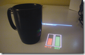
Recent advances in projector, laptop and camera technology have allowed integration of all these devices into a NHLT system that allows a portable and inexpensive laptop to provide tabletop interactions by using computer vision and tiny projection and imaging devices. On either side of laptop, a tiny projector and camera are mounted on the monitor. An adaptive Gaussian technique is used to distinguish background from foreground while skin detection is used to track user hands. A combination of laptop based accelerometer and camera view is used to identify user gestures. Object recognition is also built in to support some special interactions.

image image image image

Some of the augmented interaction provided using Bonfire are:

  • Tracking use of everyday objects for ex. coffee when coffee cup is placed.
  • Infers state of user to modify its ambient response for ex. pauses music when headphones are placed down.
  • Physical contextual bookmarks for applications so that certain apps reappear when associated physical item is present.
  • Cross-device interaction with a mobile phone or newspaper to capture images or perform data transfer.
  • Providing richer computer interaction using contextual displays such as application toolbars or extended field of views.

Authors plan on leveraging existing cameras to implement gaze tracking, depth sensing for 3D interactions and explore ‘co-located collaboration’ between multiple NHLT systems.

Review

While the work by authors is formidable, it is not clear to me what extra advantages such a scheme offers from having a portable tabletop or a touch based sensing device. The applications suggested by authors have the ‘coolness’ quotient (flicking images between mobile and Bonfire) but do not seem to be driven by any real world scenarios.

Disclaimer

The work discussed above is an original work presented at UIST 2009 by the authors/affiliations indicated at the starting of this post. This post in itself was created as part of course requirement of CPSC 436.

TapSongs: Tapping Rhythm-Based Passwords

Jacob O. Wobbrock, University of Washington

Summary

A technique for user authenticate using tapping patterns is presented.

image

Details

Authenticating users on tiny devices with no keyboards/screens can be implemented by a tapping pattern. Called TapSong, it is supported by music psychology and can adapt to successful logins. Due to individual tapping differences, this technique can withstand eavesdropping in 80-90% cases (false positives) and allow correct logins in ~85% cases (true positives).

Tappings are stored using a binary sensor as text-less passwords that are difficult to represent if stolen but easy to enter privately. Since exact timings vary with each entry, mean and SD at each position are stored to allow variability in user input as per Weber’s law. Matching algorithm calculates three parameters based on which authentication is performed.

Review

Of late, there have been cases where text based passwords have proven to be weak towards a determined hacker. Although no security analysis has been provided and true positive rate is still some distance away from 100%, TapSong technique is interesting & unique enough to justify further study.

Disclaimer

The work discussed above is an original work presented at UIST 2009 by the authors/affiliations indicated at the starting of this post. This post in itself was created as part of course requirement of CPSC 436.

Mouse 2.0: Multi-touch Meets the Mouse

Nicolas Villar, et. al., Microsoft Research

Summary

This paper evaluates some of the different ways in which multi-touch capabilities might be introduced in conventional mice-like devices.

image

Details

Clearly, multi-touch (MT) is here to stay and maps well with naturally dexterous hands. The authors perform technical design space exploration for five different MT mice. While lots of design modifications have been proposed for conventional 2-button mice, most of them have relied on single point interaction. MT techniques using vertical display or touchpad often face problems in precision and occlusion.

Five different MT mice explored include:

  • FTIR (frustrated total internal reflection) : An IR camera images hand gestures on an indirect input device augmented with a regular mouse sensor. Faces limitations in area available for MT gestures.
  • Cap (capacitive) : uses a matrix of capacitive sensors to track MT points. While providing a lower resolution than optics based approaches, it provides true MT sensing and compact form factor.
  • Arty (articulated) : uses three IR sensors under pal, thumb and index finger to provide a very high sensing fidelity.
  • Orb : As the name says, a hemispherical surface is IR imaged under internal IR illumination. The surface is ‘clickable’. While a great surface for MT, the camera image off the reflector needs un-distorting by using a vision pipeline.
  • Side : uses proximity sensing to track MT gestures around the mouse. It uses an IR scheme as in Orb and hence also needs a vision pipeline. MT sensing can occur over larger areas.

User observations reported Arty as the favourite  MT mice due to its high precision. Orb mouse was next most popular due to its form factor. All users could use MT mice in their regular tasks. Side mouse seemed to be a problem with different hand sizes while side and FTIR seemed to be bimodal in nature for MT vs. clicking.

Review

A very interesting paper, it was enlightening as well as refreshing to see different MT techniques being explored with their pros and cons.

Disclaimer

The work discussed above is an original work presented at UIST 2009 by the authors/affiliations indicated at the starting of this post. This post in itself was created as part of course requirement of CPSC 436.